Abstract Door is a personal zine that serializes the slow-motion efforts to open and enter new experiences since 2013. A new issue will be written "soon."
Issue #1: JOBS OTZ
Spring 2013
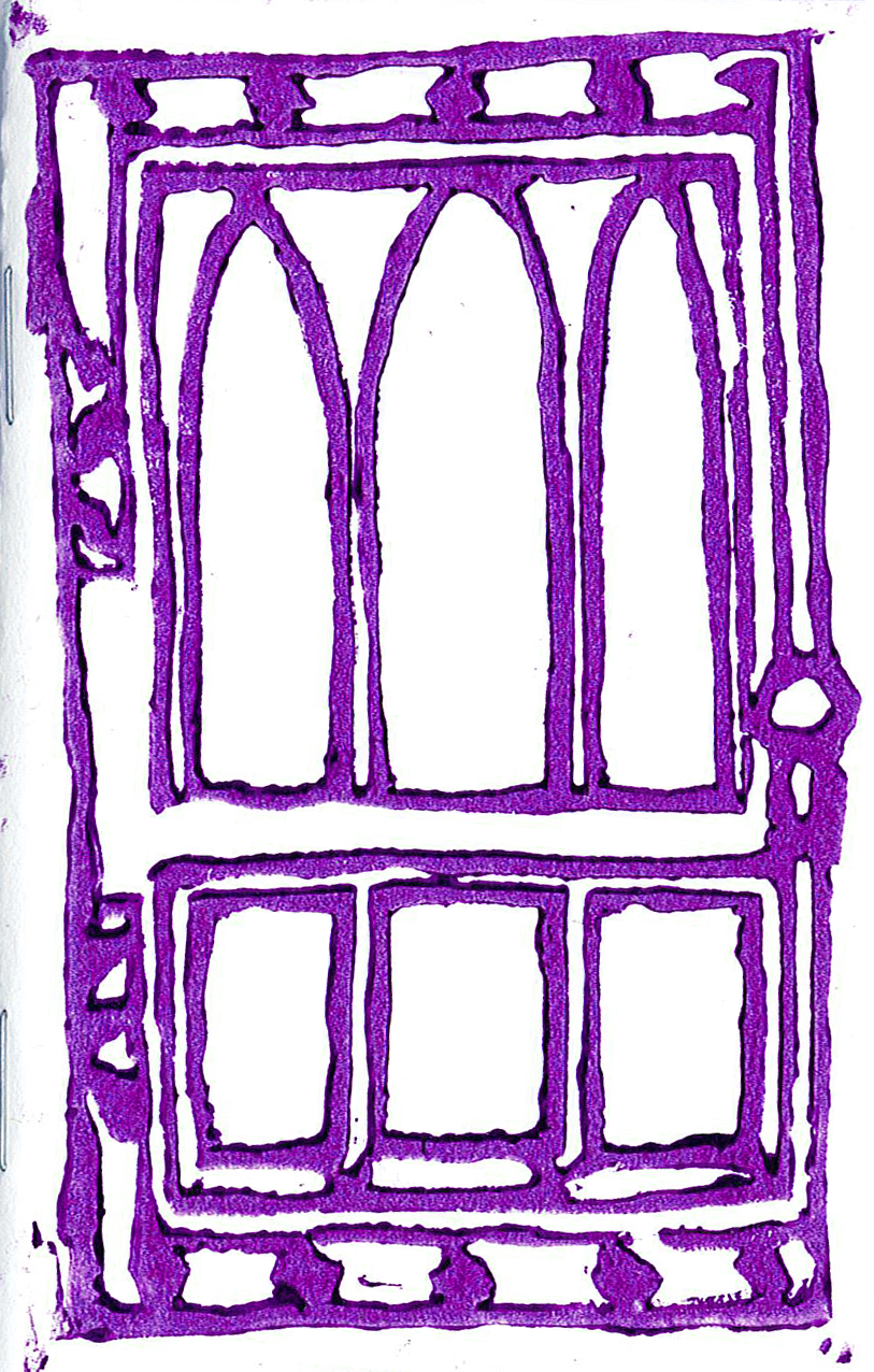
1/8 letter size, 40 pages, mainly text, violet blockprinted cover Door based on the entrance to Swift Hall. Here is an instance of being 23, applying for writing jobs after college as someone who attended UIC, NOT U of C, the pressure of achieving “success,” the anxiety and relief of being a nobody, having a tough mother-daughter relationship~
Issue #2: HOME
Summer 2013
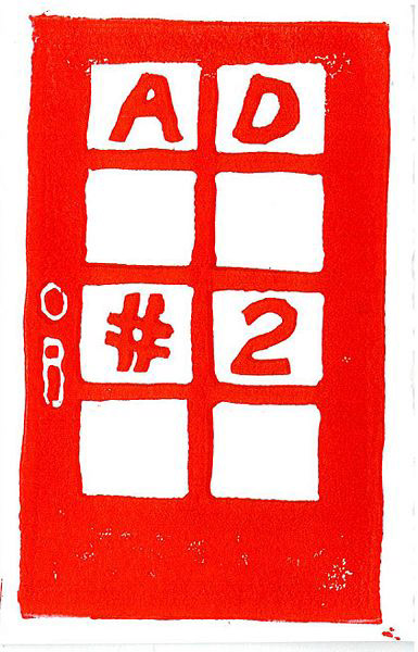
1/8 letter size, 48 pages, mainly text, red blockprinted cover Door based on the entrance of my childhood home, a third-floor unit in a family-owned building in Edgewater, where I lived in a super sun-lit small room between the ages of 2 to 16 before my family moved into a single home in West Rogers Park, where I lived in the dim, cool basement from 17-26. This issue takes place during the few months of anticipation before I get to live by myself in a one-bedroom apartment in Rogers Park. I look around my bedroom for the last time, taking inventory of material items I collected over the years, and I remember it was the end of Summer 2009 when I tried to move out of my parents’ house for the first time.
Issue #3: LETTERS TO MILENA
Fall 2013 / Winter 2014
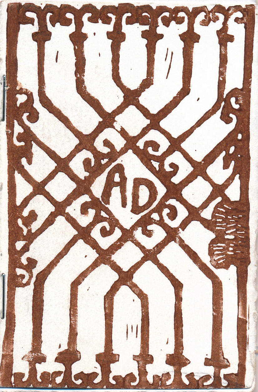
1/8 letter size, 96 pages, very text-heavy, brown blockprinted cover Door based on this iron gate on Hubbard Street I noticed during my walk from the Ashland Green/Pink Line station over to Spudnik Press. Inspired by Kafka’s Letters to Milena, this issue was intended to be the one that cringes the most. It begins with a long-distance friendship between strangers, one in Chicago, one in Budapest, who exchange long emails and eventually meet to hang out for a week in Hungary. One of them kind of likes the other, more. These letters cover the past two years since this release date and involves a coming-out & coming-of-age, talking to your crush on gchat while bored, talking about being at work, a bit of clueless rendezvous, what feels like an epiphany about relationships, and coming-to-terms with missed / connections.
Issue #4: DEATH
Fall 2014, just in time for Halloween
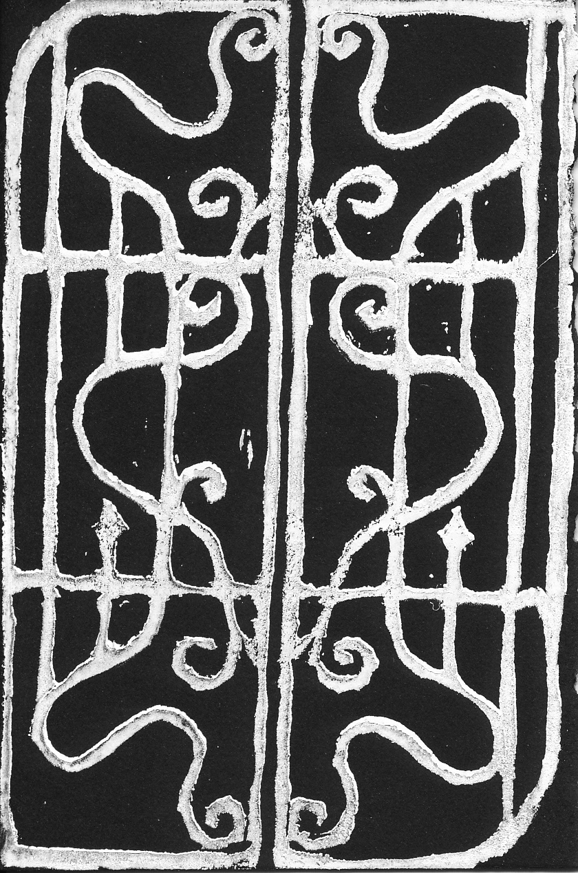
1/8 letter size, 48 pages, not text-heavy-looking thanks to arbitrary or intuitive line breaks all over the place, white blockprint on black paper Door based on iron gate I noticed right next door to Dimo’s Pizza in Lakeview, Chicago. It looks like a skeletal rorschach test in white on black so I chose it for this issue on death, nightmares, times I killed, inner demons, descending a square-spiral staircase into hell, and the despair of how things will never be the same again. I was reading Hélène Cixous’s Three Steps on the Ladder of Writingand knew, then, what I had to write. I am going to relinquish control, I will print out what I have, I will stop holding it so close to me, feeling afraid. I am aware that what I most desire to do in text has thus far been a friendly ghost version of the horror I want to write in which you can sense—but not always see—something that scares you.
Issue #5: CHICAGO
Spring / Summer 2015
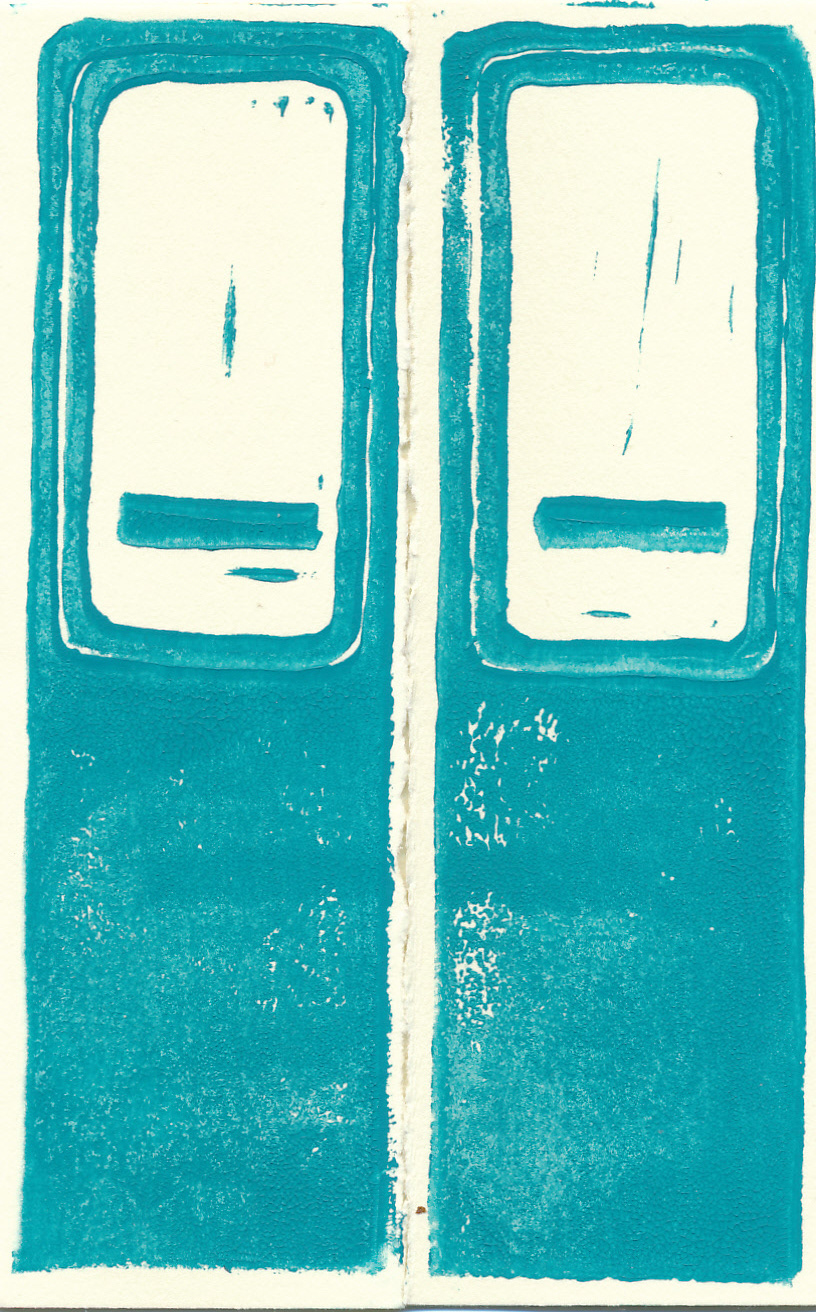
1/8 letter size, 32 pages, turquoise blockprint on cream paper The CTA Red Line is Chicago’s blood line that runs from Howard up north to 95th down south, and once I am on this train, I feel like I can get to where I want to be. In appreciation, I am using its door for this fifth cover. I wanted to do too many things in this issue—to consider my relationship to my hometown and the Midwest, to make a tour guide for friends who visit so I can immediately answer “what is there to do?”, to revise an essay I wrote on “community” in 2007, and to recreate the energy and exhaustion of a long commute, but I ended up writing a “zuihitsu.”
Issue #6: GARGOYLES & GARBAGE
Fall 2015
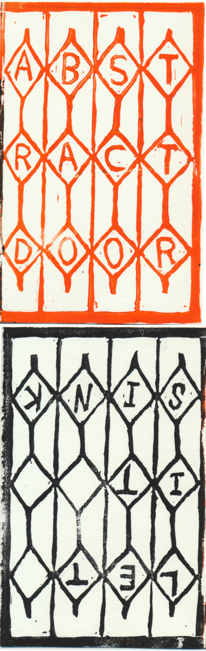
1/8 letter size, 32 pages, orange / black blockprinted cover, $3 A split zine with Let It Sink #9 (The Tears of Jim Joyce) with which I am excited to share a double door. My side is a sequel to my first issue re: jobs as I write a portrait of a gargoyle who used to be an employee within Human Resources. Jim’s side is a collection of stories about things that make him worried. We address some frightening thoughts and released this issue on the eve of Halloween along with a short horror video, Night of the Blood Zine. Our last split together was five years ago, also in time for Halloween, and this door is based on a gate I saw in San Francisco while both of us were there on a zine tour with Dave (Roche) and Blair (Bogin) this past summer. It is sooo nice and fun to collaborate with friends.
Issue #7: FEELING ALARMED
Fall 2016 / Winter 2017
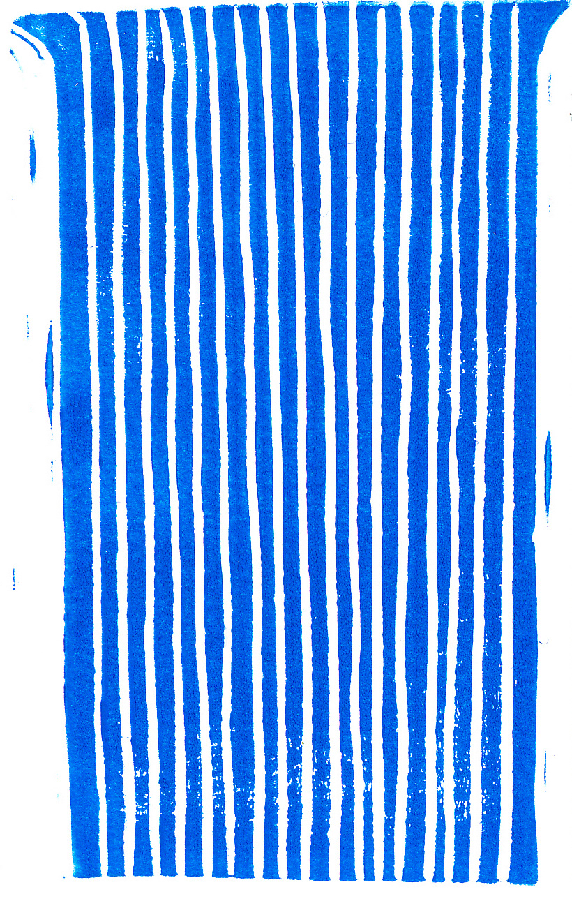
1/8 letter size, 1 sheet front and back, blue blockprinted cover, $2 This waterfall door is for Bhanu Kapil and the workshop she led on sentences and touch while in Chicago mid-February of 2016. I was re-writing a disorganized draft of this piece, which fit on a single 8.5x11" sheet of paper, for a whole year, and then realized I had been carrying around a “stone tablet,” an unbreakable page of text that I could no longer work with, so I had to smash it and let the crumbled pieces of words rearrange themselves. That is why it looks like a poem on one side. Unfold this issue to find my motivational note-to-self template on the other side.
Spring 2013
1/8 letter size, 40 pages, mainly text, violet blockprinted cover Door based on the entrance to Swift Hall. Here is an instance of being 23, applying for writing jobs after college as someone who attended UIC, NOT U of C, the pressure of achieving “success,” the anxiety and relief of being a nobody, having a tough mother-daughter relationship~
Summer 2013
1/8 letter size, 48 pages, mainly text, red blockprinted cover Door based on the entrance of my childhood home, a third-floor unit in a family-owned building in Edgewater, where I lived in a super sun-lit small room between the ages of 2 to 16 before my family moved into a single home in West Rogers Park, where I lived in the dim, cool basement from 17-26. This issue takes place during the few months of anticipation before I get to live by myself in a one-bedroom apartment in Rogers Park. I look around my bedroom for the last time, taking inventory of material items I collected over the years, and I remember it was the end of Summer 2009 when I tried to move out of my parents’ house for the first time.
Fall 2013 / Winter 2014
1/8 letter size, 96 pages, very text-heavy, brown blockprinted cover Door based on this iron gate on Hubbard Street I noticed during my walk from the Ashland Green/Pink Line station over to Spudnik Press. Inspired by Kafka’s Letters to Milena, this issue was intended to be the one that cringes the most. It begins with a long-distance friendship between strangers, one in Chicago, one in Budapest, who exchange long emails and eventually meet to hang out for a week in Hungary. One of them kind of likes the other, more. These letters cover the past two years since this release date and involves a coming-out & coming-of-age, talking to your crush on gchat while bored, talking about being at work, a bit of clueless rendezvous, what feels like an epiphany about relationships, and coming-to-terms with missed / connections.
Fall 2014, just in time for Halloween
1/8 letter size, 48 pages, not text-heavy-looking thanks to arbitrary or intuitive line breaks all over the place, white blockprint on black paper Door based on iron gate I noticed right next door to Dimo’s Pizza in Lakeview, Chicago. It looks like a skeletal rorschach test in white on black so I chose it for this issue on death, nightmares, times I killed, inner demons, descending a square-spiral staircase into hell, and the despair of how things will never be the same again. I was reading Hélène Cixous’s Three Steps on the Ladder of Writingand knew, then, what I had to write. I am going to relinquish control, I will print out what I have, I will stop holding it so close to me, feeling afraid. I am aware that what I most desire to do in text has thus far been a friendly ghost version of the horror I want to write in which you can sense—but not always see—something that scares you.
Spring / Summer 2015
1/8 letter size, 32 pages, turquoise blockprint on cream paper The CTA Red Line is Chicago’s blood line that runs from Howard up north to 95th down south, and once I am on this train, I feel like I can get to where I want to be. In appreciation, I am using its door for this fifth cover. I wanted to do too many things in this issue—to consider my relationship to my hometown and the Midwest, to make a tour guide for friends who visit so I can immediately answer “what is there to do?”, to revise an essay I wrote on “community” in 2007, and to recreate the energy and exhaustion of a long commute, but I ended up writing a “zuihitsu.”
Fall 2015
1/8 letter size, 32 pages, orange / black blockprinted cover, $3 A split zine with Let It Sink #9 (The Tears of Jim Joyce) with which I am excited to share a double door. My side is a sequel to my first issue re: jobs as I write a portrait of a gargoyle who used to be an employee within Human Resources. Jim’s side is a collection of stories about things that make him worried. We address some frightening thoughts and released this issue on the eve of Halloween along with a short horror video, Night of the Blood Zine. Our last split together was five years ago, also in time for Halloween, and this door is based on a gate I saw in San Francisco while both of us were there on a zine tour with Dave (Roche) and Blair (Bogin) this past summer. It is sooo nice and fun to collaborate with friends.
Fall 2016 / Winter 2017
1/8 letter size, 1 sheet front and back, blue blockprinted cover, $2 This waterfall door is for Bhanu Kapil and the workshop she led on sentences and touch while in Chicago mid-February of 2016. I was re-writing a disorganized draft of this piece, which fit on a single 8.5x11" sheet of paper, for a whole year, and then realized I had been carrying around a “stone tablet,” an unbreakable page of text that I could no longer work with, so I had to smash it and let the crumbled pieces of words rearrange themselves. That is why it looks like a poem on one side. Unfold this issue to find my motivational note-to-self template on the other side.